Table of Contents
This comprehensive guide will help you install, set up, and customize your RentRover Car Rental Website Template to create a sleek, professional, and user-friendly platform for showcasing your rental fleet and booking services.
rentrover Pro Theme Documentation
Introduction
Customizing Your Website
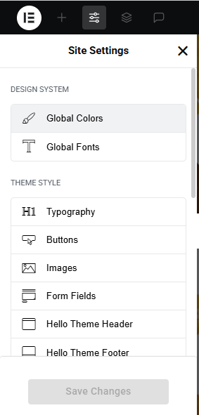
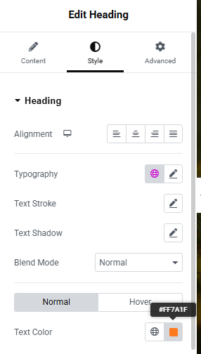
Global Settings
To set global styles:
- Go to Elementor > Site Settings.
- Adjust typography, colors, and layout settings.
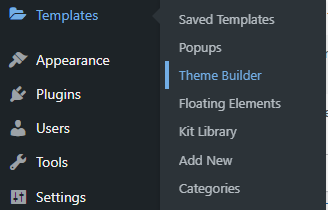
Header & Footer Setup
- Use Elementor Theme Builder to edit the header and footer.
- Customize the navigation menu, logo, and contact details.


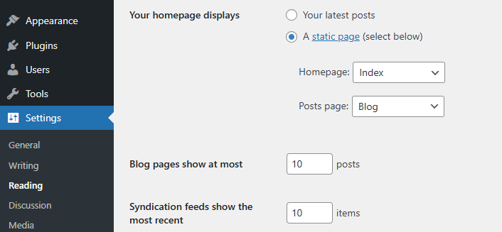
Home Page Setup
Using Pre-Built Layouts
Navigate to Setting >> Reading
Choose the Static Page option.
Choose an existing homepage or create a new one.
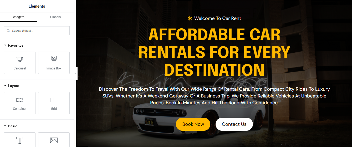
Add The Section in home page using elementor
Add components such as these using the Drag & Drop Builder:
- Hero banner Section
- offer section
- about section
- book a car section
- popular car section
- step section
- CTA section
- achievements section
- video section
- pricing plan section
- review section
- team section
- get in touch section
- blog section
- brand logo section
Main Hero Section
Set Background Image (Hero Banner)
- Under Background, set:
- Background Type: Classic
- Image: Upload your banner image
- Position: Center Center
- Attachment: Scroll or Fixed
- Repeat: No-Repeat
- Size: Cover
- Content Width: Full Width
- Min Height: e.g. 600px
- Vertical Align: Middle
Add Content (Heading, Text, Button, Video Link)
- Drag a “Heading” widget – Add:
- Set HTML Tag to H1
- Align: Center or Left
- Use inline text styling for highlighted text.
- Add another “Heading” or Text Editor for tagline:
- Add “Text Editor” widget for description:
- Add a “Button” widget:
- Style: Background color #f8b400 (yellow), text black
- Add another Button for “contact us” (optional)
offer Section

1. Add a New Section
- Open your page in Elementor.
- Click the ➕ icon to add a new section.
- Choose the 4-column layout.
2. Set Section Title
- Above the columns, drag in a Heading widget.
- Type your section title (e.g., “Our Offers”).
- Style it as needed (font, size, color).
3. Add Content to Each Column
For each of the 4 columns:
a. Add Image
- Drag an Image widget into the column.
- Upload or select your offer image.
b. Add Title
- Drag a Heading widget below the image.
- Enter the offer title (e.g., “Weekend Special”).
c. Add Description
- Drag a Text Editor widget below the title.
- Write a short description of the offer.
4. Style the Columns
a. Set Black Background
- Click on the column → go to Style tab.
- Under Background, choose Classic → set color to black (#000000).
b. Add Padding
- Under Advanced tab → add padding (e.g., 20px) to give space inside the column.
5. Add Hover Effect (Yellow Background)
Click on the column → go to style → added hover color add
About Section

1. Add a New Section
- Click the ➕ icon to add a new section.
- Choose the 2-column layout (50/50).
2. Left Column – Add Image
- Click on the left column.
- Drag an Image widget into it.
- Upload or select your image
- Style it with padding or border radius if needed.
3. Right Column – Add Content Block
- a. Add Inner Section (Optional for Layout Control)
- Drag an Inner Section into the right column.
- This helps organize content vertically.
b. Add Title
- Drag a Heading widget into the inner section.
- Type your title
c. Add Tagline
- Drag another Heading widget below the title.
- Use a smaller size or different style
- d. Add Description with Yellow Background
- Drag a Text Editor widget below the tagline.
- Write your description.
- Go to Style → Background → Classic → Color → choose Yellow (#FFD700).
- Add padding (e.g., 20px) and border radius for a clean look.
4. Add Progress Bars
- Drag two Progress Bar widgets below the description.
- Set titles like “Customer Satisfaction” and “Fleet Availability”.
- Adjust percentage values (e.g., 95%, 80%).
- Style bars with custom colors if needed.
5. Add Button
- Drag a Button widget below the progress bars.
- Label it
- Link it to your services or booking page.
- Style: Choose a bold color (black or yellow) and hover effect.
6. Add Call Text with Icon
- Drag an Icon List widget or Icon + Text widget below the button.
- Use a phone icon and text like “Call Us: +91-98765-43210”.
- Style the icon and text with spacing and alignment.
book car Section

1. Add a New Section
- Click the ➕ icon to add a new section.
- Choose the 2-column layout (50/50).
2. Set Section Background to Yellow
- Click the section handle (blue tab at the top).
- Go to Style → Background → Classic → Color.
- Choose Yellow (#FFD700 or your brand yellow).
- Add padding (e.g., 40px top/bottom) for spacing.
3. Left Column – Add Man Image
- Click on the left column.
- Drag an Image widget into it.
- Upload or select your image (e.g., man standing near a car).
- Style it with max width, border radius, or box shadow if needed.
4. Right Column – Add Form Block
- a. Add Inner Section (Optional for layout control)
- Drag an Inner Section into the right column.
- b. Set Column Background to Black
- Click the right column → go to Style → Background → Classic → Color.
- Choose Black (#000000).
- Add padding (e.g., 30px) and border radius (e.g., 10px).
5. Add Title
- Drag a Heading widget into the black column.
- Type something like “Book Your Ride”.
- Style it with white text, bold font, and spacing.
6. Add Form
- You can use:
- Elementor Form widget (Pro)
- Or WPForms, Contact Form 7, or Fluent Forms (Free plugins)
a. Form Fields
- Include:Name, Email, Phone, Pickup Date, Car Type (Dropdown), Submit Button
b. Style the Form
- Set text color to white.
- Set input background to dark gray or black.
- Style the submit button with yellow background and hover effect.
popular car Section
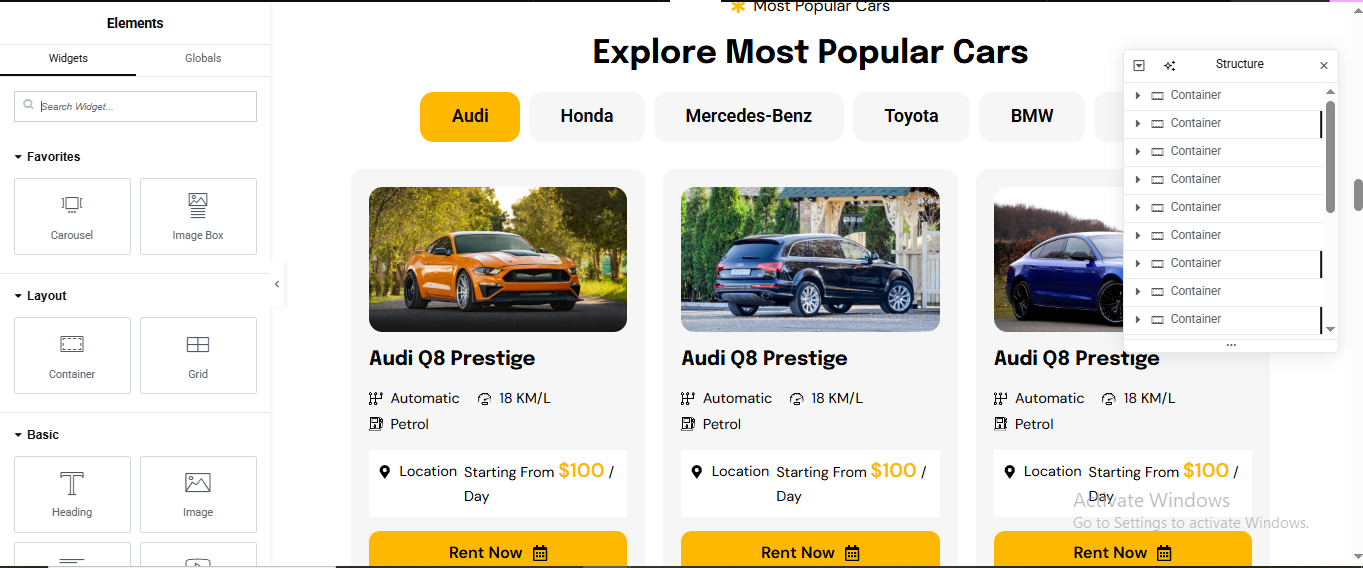
1. Add a New Section
- Click the ➕ icon to add a new section.
- Choose 1-column layout.
- Drag a Heading widget into it.
- Set your title: “Popular Cars”
- Style it as needed (centered, bold, etc.)
2. Add Tabs Widget
- Drag the Tabs widget
- Rename each tab:Audi, Honda, Mercedes, Toyota, BMW, Tesla
3. Design Inner Tab Content (Per Brand)
- Inside each tab, you’ll create a 3-column layout showing car details.
a. Use Inner Section
- Inside each tab’s content area, drag an Inner Section.
- Set it to 3 columns.
b. Column 1 – Car Image
- Drag an Image widget into the first column.
- Upload the car image (e.g., Audi Q8 Prestige).
- Style with padding or border radius.
c. Column 2 – Car Title & Specs
- Drag a Heading widget → set car title (e.g., Audi Q8 Prestige).
- Below it, drag a Text Editor widget → list specs:
- d. Column 3 – Pricing & Button
- Drag a Text Editor widget → write:
- Below it, drag a Button widget → label it “Rent Now”
- Link it to your booking page or contact form.
4. Style the Section
- Set background color of the section or tabs to match your brand.
- Use hover effects on buttons (e.g., yellow background on hover).
- Add padding and spacing between columns for clean layout.
5. Repeat for Each Tab
- Copy the 3-column layout into each brand tab.
- Replace image, title, specs, and pricing for each car.
step Section

1. Add a New Section
- Click the ➕ icon to add a new section.
- Choose the 4-column layout.
2. Add Main Title
- Above the columns, drag a Heading widget.
- Type your section title (e.g., “How It Works” or “4 Easy Steps”).
- Style it (centered, bold, large font).
3. Design Each Column (Step Box)
- Repeat the following setup for all 4 columns:
a. Add Inner Section (Optional for layout control)
- Drag an Inner Section into each column for better control.
b. Set Black Background
- Click on the column → go to Style → Background → Classic → Color.
- Set to Black (#000000).
- Add padding (e.g., 20px) and border radius (e.g., 10px).
c. Add Image
- Drag an Image widget into the column.
- Upload or select your image
d. Add Step Number (Top-Right Corner)
- Option 1: Use a Positioned Heading
- Drag a Heading widget into the column.
- Type “Step 1”, “Step 2”, etc.
4. Add Step Title & Description
- Drag a Heading widget below the image
- Drag a Text Editor widget below the title
- Style both with white text and spacing.
5. Repeat for All 4 Steps
- Duplicate the column and update:Image, Step number, Title, Description
CTA Section

1. Add a New Section
- Click the ➕ icon to add a new section.
- Choose the 2-column layout.
- Click the column handle of the left column → set Column Width to 70%.
- Set the right column to 30%.
2. Left Column – Add Content
a. Tagline
- Drag a Heading widget into the left column.
- Use a smaller font size (e.g., “Ready to hit the road?”).
b. Main Title
- Drag another Heading widget below the tagline.
- Use a bold, larger font (e.g., “Rent Your Dream Car Today”).
c. Description
- Drag a Text Editor widget below the title.
- Write a short paragraph (e.g., “Choose from a wide range of premium vehicles and enjoy hassle-free booking.”).
- Style with spacing and font color to match your theme.
3. Right Column – Add Buttons
a. Button 1 – Get in Touch
- Drag a Button widget into the right column.
- Label it “Get in Touch”.
- Go to Style → Background Color → set to White.
- Set Text Color to Black.
- Add Border (optional): 1px solid black.
- Add Padding (e.g., 15px top/bottom, 30px left/right).
b. Button 2 – Book Now
- Drag another Button widget below the first.
- Label it “Book Now”.
- Set Background Color to Black.
- Set Text Color to White.
- Add hover effect: yellow background (#FFD700) and black text.
4. Align Buttons Vertically
- Click the right column → go to Layout → Vertical Align → choose Middle.
- Add spacing between buttons using margin (e.g., 20px bottom on the first button).
5. Style the Section
- Add padding to the section (e.g., 40px top/bottom).
- Optional: Set a background color or image for the entire section.
- Use motion effects (fade-in, slide-up) for dynamic feel.
achievement Section
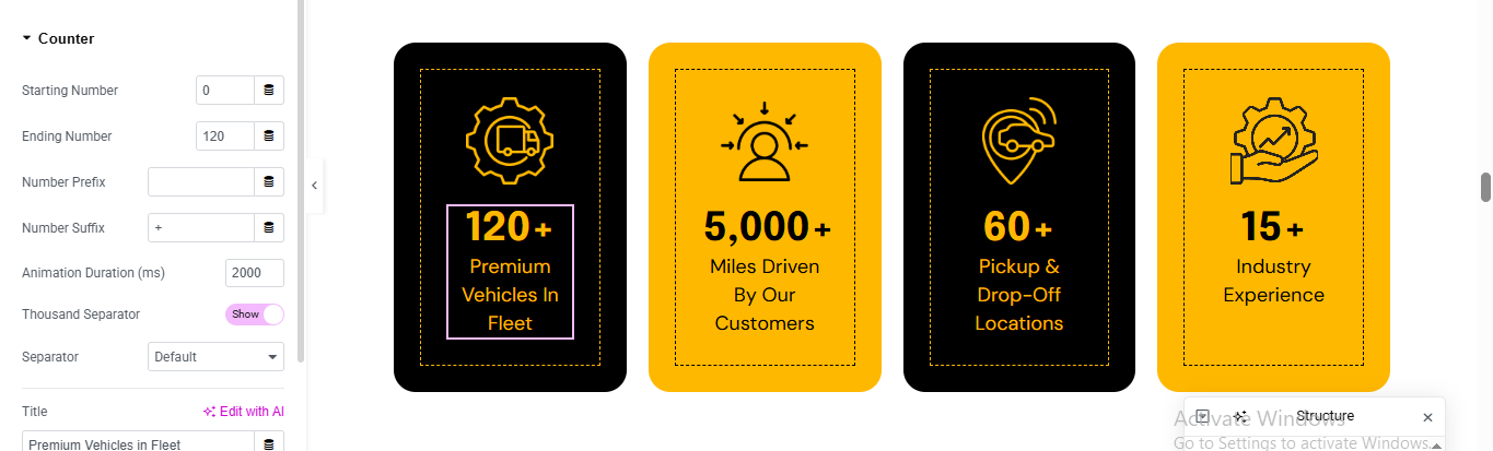
1. Add a New Section
- Click the ➕ icon to add a new section.
- Choose the 4-column layout.
2. Design Each Column (Achievement Box)
- Repeat the following setup for each column:
a. Add Inner Section
- Drag an Inner Section into each column for better spacing and alignment.
b. Set Background Color
- Click on each column → go to Style → Background → Classic → Color.
- Column 1 & 3: set to Black (#000000)
- Column 2 & 4: set to Yellow (#FFD700)
- Add padding (e.g., 30px) and border radius (e.g., 10px) for clean design.
c. Add Icon
- Drag an Icon widget into the column.
- Choose an icon (e.g., trophy, star, car, user).
- Style it:
- Size: 40–60px
- Color: White for black boxes, Black for yellow boxes
d. Add Counter Number
- Drag a Counter widget below the icon.
- Set the number (e.g., 500+, 1000+, etc.).
- Style:
- Font size: 40–60px
- Color: Match icon color
e. Add Title
- Drag a Heading widget below the counter.
- Example titles: “Happy Customers”, “Cars Rented”, “Cities Served”, “Years of Service”
- Style with bold font and matching color.
3. Spacing & Alignment
- Center-align all content in each column.
- Add vertical spacing using margin or padding.
- Use motion effects (fade-in, zoom-in) for dynamic feel.
video Section

1. Add a New Section
- Click the ➕ icon to add a new section.
- Choose a 1-column layout.
2. Set Background Image
- Click the section handle (blue tab at the top).
- Go to Style → Background → Classic → Image.
- Upload or select your background image (e.g., car, road, or team photo).
- Set:Position: Center Center, Attachment: Scroll or Fixed, Repeat: No-repeat, Size: Cover
3. Add Title
- Drag a Heading widget into the section.
- Type your title (e.g., “Watch Our Story” or “See RentRover in Action”).
- Style it with white or bold text depending on your background.
4. Add Play Button
- Option 1: Use Elementor’s Video Widget
- Drag the Video widget into the section.
- In Content → Link, paste your video URL (YouTube, Vimeo, or self-hosted).
- Enable Image Overlay:
- Upload a play icon image or use the default.
- Set Play Icon size and color.
- Enable Lightbox → this opens the video in a popup.
- Option 2: Use an Icon Widget (Custom Play Button)
- Drag an Icon widget (choose ▶️ or custom SVG).
- Go to Link → Lightbox URL (YouTube or Vimeo).
- Style:
- Size: 60–100px
- Color: White or Yellow
- Add hover effect (scale or glow)
5. Center the Content
- Click the column → go to Layout → Vertical Align → Middle.
- Center-align text and icon using Style → Alignment.
pricing plan Section

1. Add a New Section
- Click the ➕ icon to add a new section.
- Choose the 3-column layout.
2. Add Section Title
- Above the columns, drag a Heading widget.
- Type your section title (e.g., “Choose Your Plan” or “Flexible Rental Packages”).
- Style it with bold font, center alignment, and spacing.
3. Design Each Pricing Plan Box
- Repeat the following setup for all 3 columns:
a. Add Inner Section
- Drag an Inner Section into each column.
b. Add Plan Title
- Drag a Heading widget
- Style with bold font and spacing.
c. Add Description
- Drag a Text Editor widget below the title.
- Write a short description (e.g., “Perfect for short city rides.”)
d. Add Price
- Drag another Heading widget
- Below it, drag a Text Editor widget → write: “1 Day – 5,000 km”
- Style both with bold fonts and spacing.
e. Add Bullet Points
- Drag an Icon List widget.
f. Add Button
- Drag a Button widget below the list.
- Label it “Book Now” or “Choose Plan”
- Style:
- Background: Black
- Text: White
- Hover: Yellow background, black text
4. Style the Boxes
- Click each column → go to Style → Background → Classic → Color
- Use light gray, white, or gradient for visual separation
- Add padding (e.g., 30px), border radius (e.g., 10px), and box shadow for depth
review Section
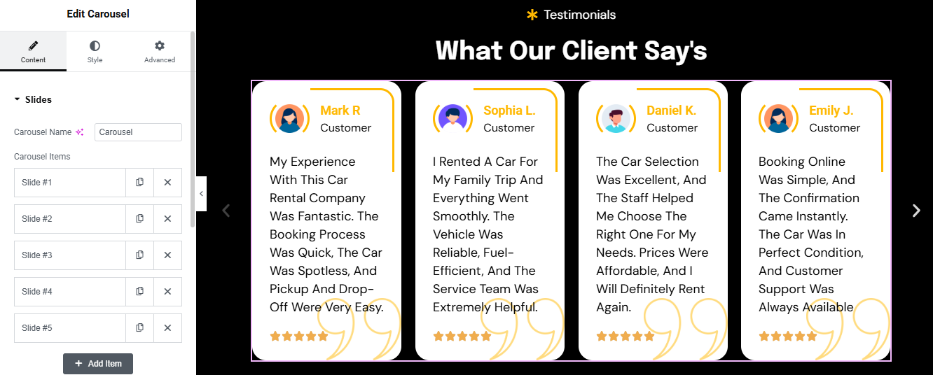
1. Add a New Section
- Click the ➕ icon to add a new section.
- Choose a 1-column layout.
2. Add Section Title
- Drag a Heading widget into the section.
- Type your title (e.g., “Customer Reviews” or “What Our Clients Say”).
- Style it with bold font, center alignment, and spacing.
4. Configure Each Review Slide
- For each review item:
a. Image Box
- Upload the reviewer’s photo.
- Style with circle shape or border radius.
b. Member Name & Position
- Add a Heading widget for the name (e.g., “Aarav Patel”).
- Add a Text Editor widget for the position (e.g., “Fleet Manager”).
c. Review Description
- Add a Text Editor widget with the review text.
- Example: “RentRover made my weekend trip smooth and hassle-free. Highly recommended!”
d. Star Rating
- Use the Star Rating widget (available in Elementor Pro or via addons).
- Set rating (e.g., 4.5 stars).
- Style: Color: Yellow (#FFD700), Size: 20–30px
5. Style the Carousel
- Set background color (white, light gray, or gradient).
- Add padding and box shadow for depth.
- Enable autoplay, loop, and navigation arrows if desired.
team Section

1. Add a New Section
- Click the ➕ icon to add a new section.
- Choose the 4-column layout.
2. Add Section Title
- Above the columns, drag a Heading widget.
- Type your title
- Style it with bold font, center alignment, and spacing.
- 3. Design Each Team Member Box
- Repeat the following setup for all 4 columns:
a. Add Image
- Drag an Image widget into the column.
- Upload the team member’s photo.
- Style: Shape: Circle or square, Border radius: 50% for circle, Box shadow: Optional for depth
b. Add Name
- Drag a Heading widget below the image.
- Type the member’s name (e.g., “Aarav Patel”).
- Style with bold font and center alignment.
c. Add Position
- Drag a Text Editor widget below the name.
- Example: “Fleet Manager” or “Customer Support Lead”
- Style with smaller font and muted color.
d. Add Social Icons
- Drag a Social Icons widget below the position.
- Add platforms like LinkedIn, Facebook, Instagram, Twitter.
- Style: Icon color: Brand colors or monochrome, Size: 20–30px, Alignment: Center, Hover effect: Scale or color change
4. Style the Columns
- Add padding (e.g., 20–30px) to each column.
- Use background color (white, light gray, or gradient).
- Add border radius and box shadow for card-style layout.
CTA Section

1. Add a New Section
- Click the ➕ icon in Elementor.
- Choose the 2-column layout.
- Click the column handle of the left column → set Column Width to 70%.
- Set the right column to 30%.
2. Left Column – Title & Description
a. Add Title
- Drag a Heading widget into the left column.
- Type your CTA title
- Style it with bold font and appropriate size.
b. Add Description
- Drag a Text Editor widget below the title.
- Write a short description
- Style with spacing and font color to match your theme.
3. Right Column – Phone Number & Button
a. Add Phone Number
- Drag an Icon List widget or Text Editor widget into the right column.
b. Add “Get in Touch” Button
- Drag a Button widget below the phone number.
- Label it “Get in Touch”.
- Style:Background Color: White, Text Color: Black, Border: 1px solid black, Hover Effect: Yellow background, black text
4. Style the Section
- Click the section handle → go to Style.
- Add padding
- Optional: Set a background color or image for the entire section.
- Use motion effects (fade-in, slide-up) for dynamic feel.
news Section

1. Add a New Section
- Click the ➕ icon to add a new section.
- Choose the 3-column layout.
2. Add Section Title
- Above the columns, drag a Heading widget.
- Style it with bold font, center alignment, and spacing.
3. Design Each News Card (Column)
- Repeat the following setup for all 3 columns:
4. Featured Image
- Use high-quality, relevant images (e.g., car photos, rental experiences, events).
- Recommended size: 800×600 px or larger.
- Make sure the image has a clear subject and works well as a thumbnail.
5. Post Title
- Keep it short, clear, and clickable.
6. Excerpt / Description
- Write a short summary (30–50 words) that hooks the reader.
- Example: Use keywords for SEO (e.g., car rental, Rajkot, SUV, luxury cars).
- it’s not compalsary if you wish description show otherwise hide
7. Category Tag
- Assign categories like:Offers, News, Tips, Events, Fleet Updates
- These will appear as top-right tags on the image if styled correctly.
8. Read More Button
- Elementor will auto-generate this if enabled.
- Make sure your post has enough content to justify a “Read More” click.
- Style the button in Elementor:
- Background: Black
- Text: White
- Hover: Yellow background, black text
Hit the road with freedom and style. At RentRover, we offer dependable, well-maintained vehicles to match every journey—whether you’re planning a weekend escape, a business trip, or a daily commute. With flexible plans, premium service, and a fleet you can trust, renting a car has never been this effortless. Choose comfort, choose control—book your ride today and drive your way.